We’ve blogged before about how financial services, particularly asset management, is behind the curve in terms of web design and user experience. But things are changing, slower than other industries, but changing they are and for the better.
Web design trends affect all industries, so we’re starting to see the latest design techniques applied to fund manager websites. The driving factor behind this movement should (hopefully) be one thing: a better experience for users. With analytical tools, fund marketers can work out what advisors and investors need from their websites and make that user journey simpler and more engaging.
We review five examples of the latest web design trends being used in the investment management industry:
1. Responsive design
Companies have woken up to the benefits of making a website responsive. It’s no longer just a theory or a passing fad, after all, mobile usage has started to overtake desktop usage. With thousands of different types of mobile devices (phones, tablets, phablets!), it’s easy to see why it’s worth investing in making your website display correctly for as many users as possible.
One of our favorite responsive sites by an asset manager is from Columbia Threadneedle.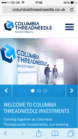
2. Longer, scrolling pages
One of the most popular trends across web design in recent years is the advent of longer form pages that require lots of scrolling, but less clicking. This type of web design accompanies another recent trend — storytelling through content. As users become used to scrolling through much longer pages, they can absorb various snippets of information on their journey. When you consider how much information is often packed into financial websites, this style of web design lends itself perfectly to the fund management industry.
A great example of long-form scrolling is the home page for MFS. Their history page is also great example of storytelling through web design.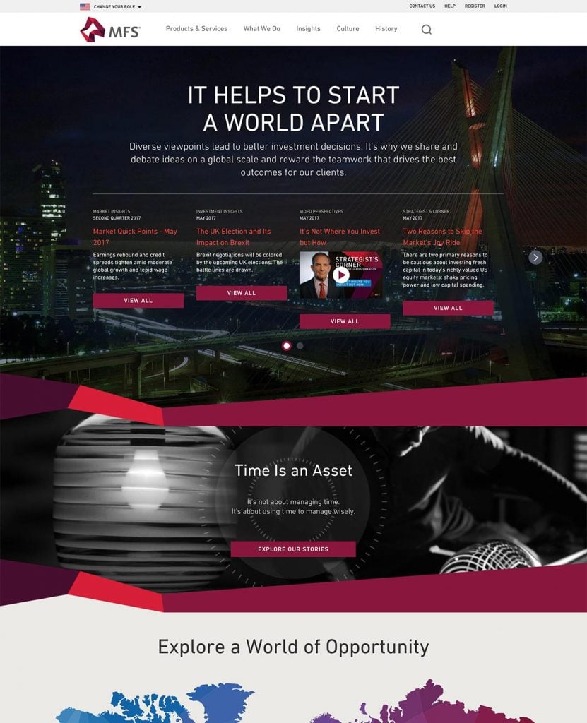
3. Aligning fund data with content
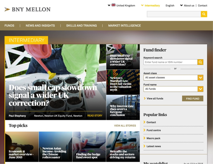
Now, more fund marketers understand the benefits of content marketing. The next logical phase is aligning their valuable fund performance data alongside regularly published content such as insights, news or fund manager commentaries. Many financial sites seem to segregate their information into silos, probably due to lack of flexibility with their website and CMS. Think how useful it is for an investor or advisor to get fund performance data connected with the content they are reading.
The BNY intermediary site is a good example of aligning fund data with regular content.
4. Full screen graphics & large typography
One of the most common trends in web design (in any industry) is the use of large photography and custom graphics, accompanied by large typography. Designers are making use of more real estate on wider screens and also taking advantage of the ability to inject custom fonts into web pages using services like Typekit.
Good examples are from Russell Investments and Credit Suisse.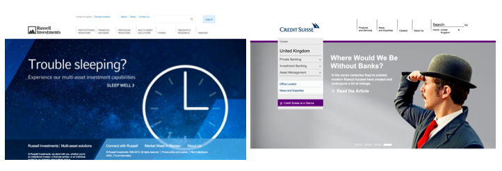
5. Simplification – removal of clutter
This is a trend that is less notably obvious and more of a slow burn across websites in the asset management industry. Through a culmination of mobile device usage, responsive web design, mobile-first design and user experience design – web designers have sought to simplify user interfaces and reduce general on screen noise. Navigations have become more condensed with less options, and carousels and slideshows help to collate information which all help to improve the general user experience.
GAM have done a nice job of simplifying their website. Have a look at their Insights page.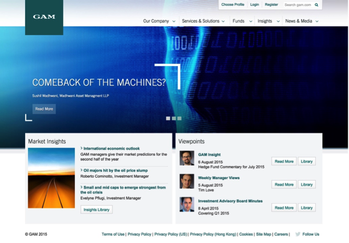
We’re excited about the changes that are happening in the asset management industry and it’s great to see these modern trends being utilised in their websites. If you’ve spotted other investment management websites using these or other modern web design techniques, drop us a comment and let us know.


