Read our latest white paper on the 25 Best Asset Management Websites (03 March 2021).
Documents are a critical part of any investment product and so careful attention is required in presenting these on asset management websites. This is especially important for those investment managers literally generating thousands of documents across multiple share classes, languages and so on. Investors and advisors will want to navigate to the relevant documents as quickly as possible, but also welcome automated distribution (being emailed relevant docs when they are published). We look at seven great examples of fund document libraries that improve the user experience and contain some clever features. Read our latest blog on the subject: 5 ways to improve UX on your asset management website without a designer.
1. Legg Mason

Legg Mason’s literature library comes with some nice design touches and usability features. The initial page is clearly laid out and highlights some ‘featured literature’, but also contains preset searches many investors will look for such as Mutual Fund Factsheets. This view comes with many useful search filters across all their material types as well as types of investment. Once within these results users gain access to useful features such as ’email a friend’, share or ‘place an order’ link for registered advisors. The whole site has been designed responsively so works well on all screen sizes.
2. PIMCO
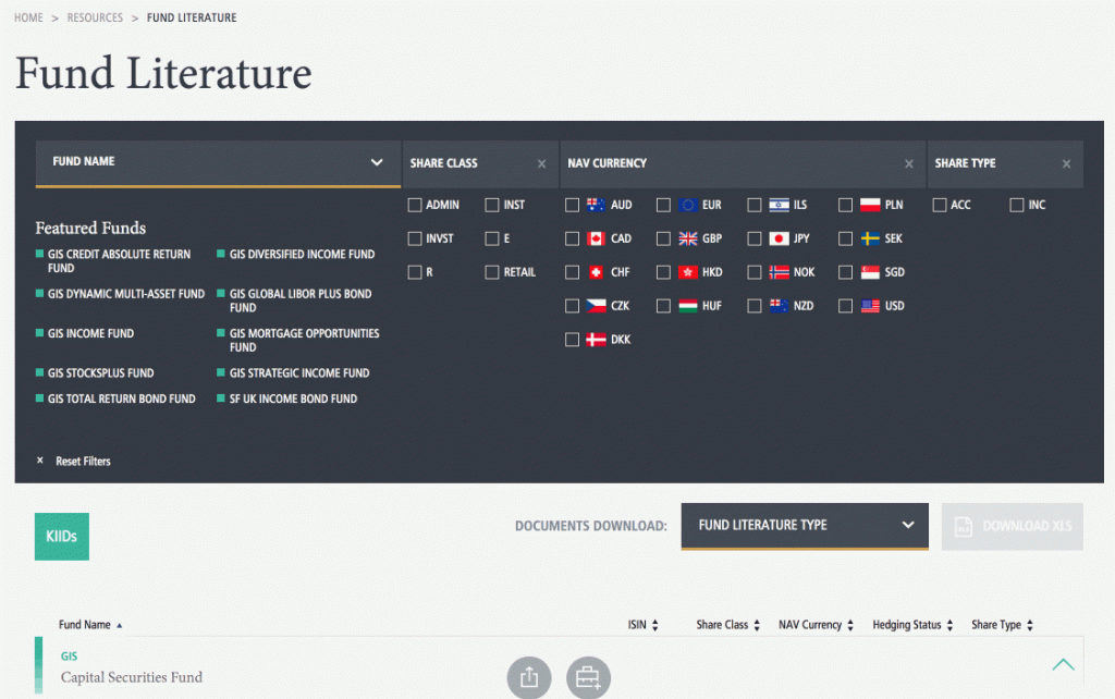
PIMCO have created a Fund Literature Library with the user in mind. As we all come to expect these days, the site has been designed responsively so works perfectly on mobile screens. A useful panel of filters allows users to quickly locate groups of documents based on criteria such as currency, share class and share type. Once documents are located users have the ability to share, ‘add to my content’ or ‘subscribe’ to documents. Giving investors the ability to subscribe to individual documents by email is a great feature. Users can also download XLS files of groups of documents, e.g. ‘all fund factsheets’ which contain all the useful tabular data as well as links to the individual PDFs.
3. BlackRock
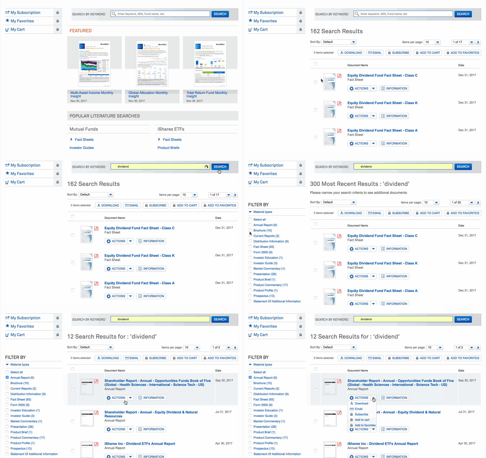
BlackRock’s literature library highlights a small number of ‘featured’ documents, but also allows the user to easily drill down into preset searches such as fact sheets, prospectuses and annual reports. Once in these results, users can access a range of tools including email, favourite, subscribe and add to cart, with some of these requiring a registered account to function. An information button displays extended info for that document without taking up real estate on the page. The design of this library may look a little dated, but the functionality makes up for that with a fast and effective document library.
4. AXA
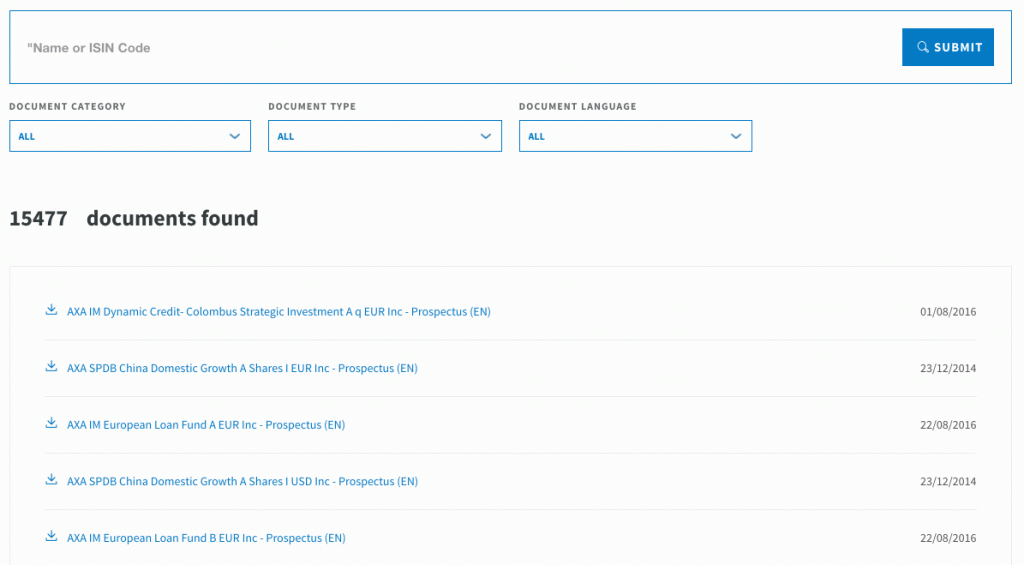
The AXA Fund document library is simple, responsive and allow users to navigate quickly through over 15,000 docs. The standout feature we like is the large typeahead search which starts to populate with results as you type, a feature we’re all used to seeing in search engines. The library also comes with pagination control so you can display up to 100 results per page, and it also lets you download an XLS file of the search results – which is very quick and useful.
5. Goldman Sachs
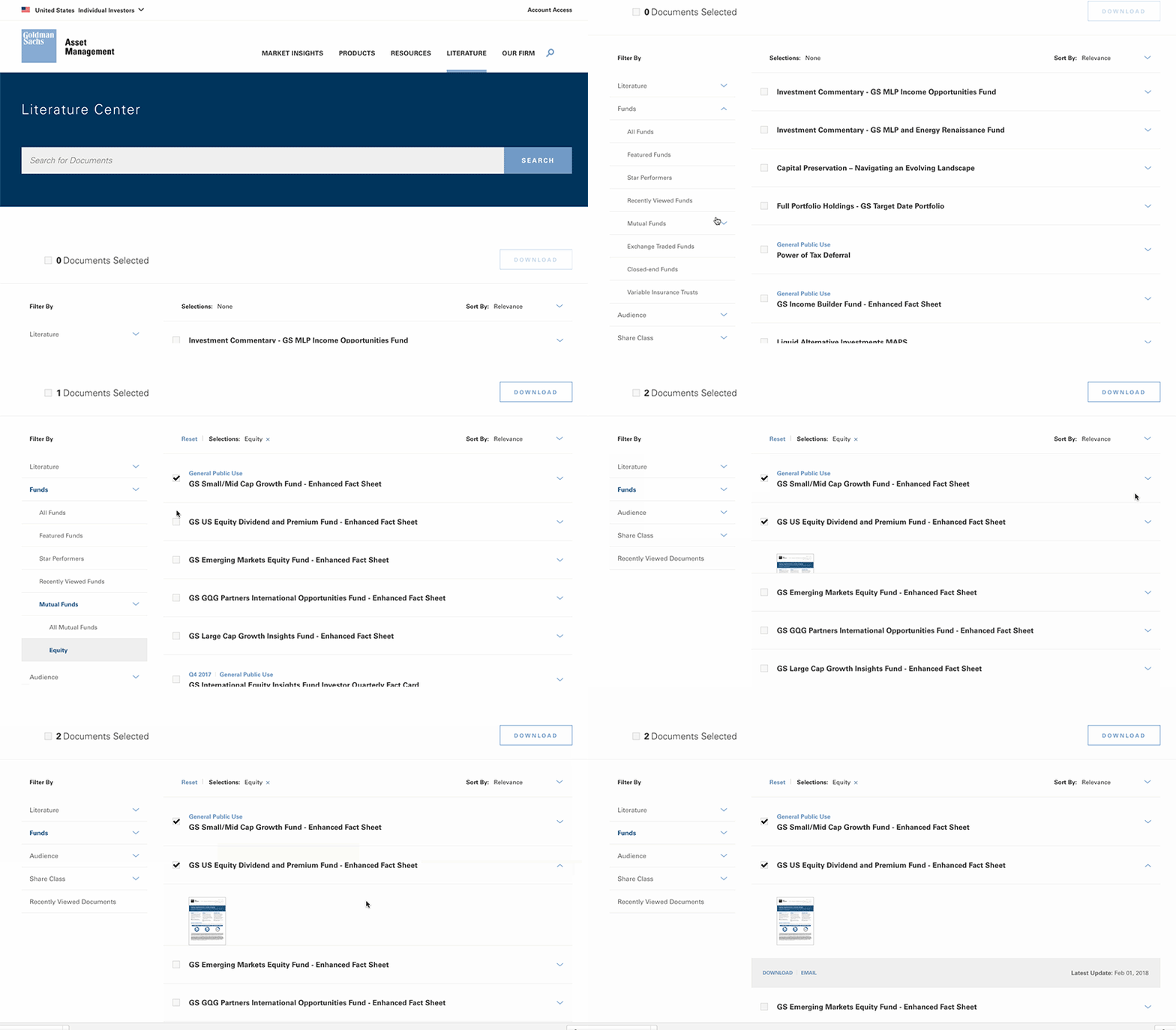
The Goldman Sachs Literature Centre comes with various useful filters across their fund range including shares classes and audience type. It also comes with a handy Recently Viewed Docs feature. The library interface allows you to bulk select documents and then download a zip file, as well as expand the info for individual documents to see thumbnails and email someone directly from the library. The design of the literature centre is clean and uncluttered, as well as responsive for mobile screens.
6. Franklin Templeton
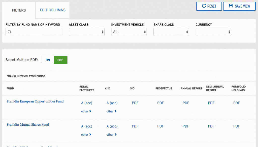
Franklin Templeton’s literature library reflects the same high quality design as the rest of their website. Users can edit the table columns to reduce the results if they are only looking for certain docs. They can also ‘save a view’ which effectively generates a long URL that can be saved/bookmarked to display a specific page of results. Hitting the ‘select multiple PDFs’ button allows users to multi-select files and then download them in bulk, or email them directly from that page. Everything also looks great on mobile screens.
7. Lazard
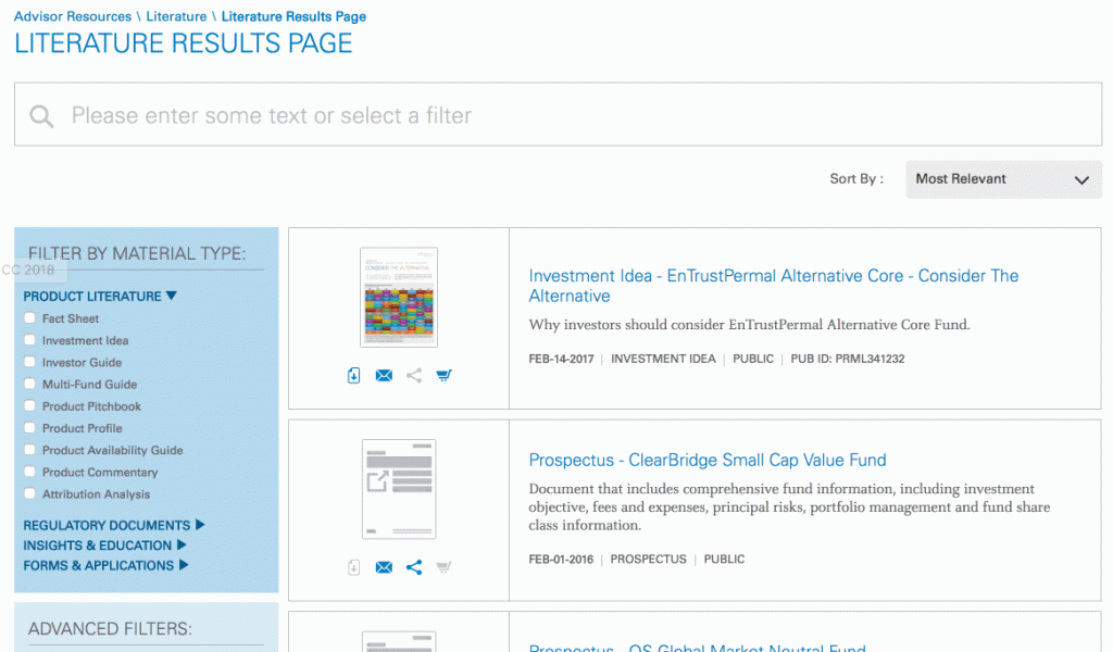
Lazard’s document library covers all their literature, including thought leadership materials. Simple filters allow for improved search results and the search function also changes the results as you type, registered website users can also bookmark items which is useful feature. We also liked the in-search filters for the ‘funds fact cards’ which display both the latest version and earlier reports. The library has been responsively designed so also works well on mobile screens.
Have you seen a good example of a fund document library recently?
Click on the button below to Get a Demo to see how Kurtosys can help your business with a fund document library.
