You must read this before proceeding, as it explains both the legal and regulatory restrictions which apply to the information contained and investment products referred to within this website.
Look familiar?
We are all used to clicking the accept button immediately on an investment manager’s website, and possibly scrolling very quickly through the small print before gaining access to a web page. Investor type selectors, or attestations as they’re known, are often a painful start to a website’s user experience, often asking a user to click five times before they’ve even hit the home page. With increased regulation, these panels will only become more complicated, and for a global asset manager there are multiple languages, investor types and disclaimers to juggle, not to mention multiple screen sizes to accommodate.
Therefore, the design and UX of these attestations has never been more critical. They should also be seen as an opportunity. As users strive for more personalised experiences, these gateways allow asset managers to tailor their content to specific audiences which will increase engagement and reduce bounce rates.
1. Carmignac

Carmignac’s profile selector is straightforward, with four clear calls to action, differentiating private and professional investor types. After a user selects their correct profile, a succinct box outlining terms and conditions for the fund information is displayed, with the modest amount of text making it wholly digestible and quick for the user to accept. The website caters to multi-language types too, which the user can toggle between in the useful top toolbar, all displayed using attractive flag icons.
2. Generali Investments
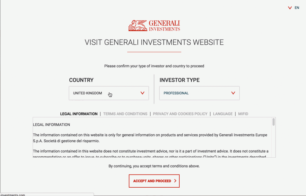
Also catering for multiple languages is the site for Generali Investments. The left-hand side attestation on the top toolbar allows the user to select one of three different sites using a simple drop-down list: Europe, German Group Network and Luxembourg. In a similar vein is the investor type and country selector, albeit packed with a multitude of information. Still, given the fact that it displays legal information, terms and conditions, privacy and cookies policy and even material pertaining to MiFID, the user experience is maximised by the use of a toggle toolbar and smart drop-down lists. It’s a mega-menu attestation that has placed the ease for users as the top priority.
3. Hermes Investment Management
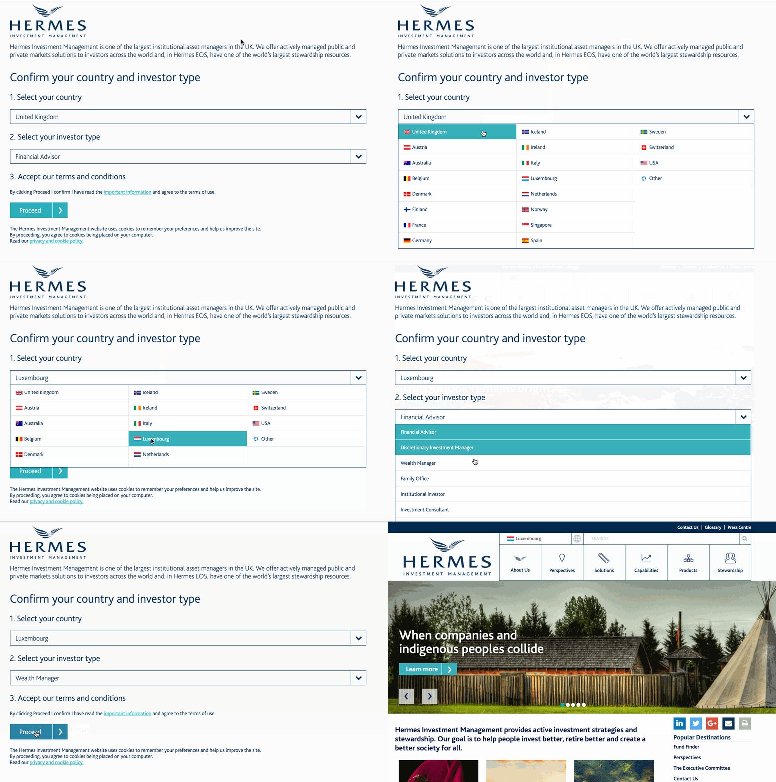
Hermes’ top toolbar usefully reminds the user exactly which catered site they are using, ‘You are viewing UK Institutional’ for example. This is of course a reminder that their attestation is cookie based and saves a user’s preferences to eliminate the re-submission of information. Then again, users can change their country and investor type, and the beautifully designed attestation is commendable in that it fills the whole desktop or mobile screen, with clear calls to action. These require few clicks, and users are reminded that their preferences are saved with cookies being placed on their computer before proceeding to the site.
4. J.P. Morgan Asset Management
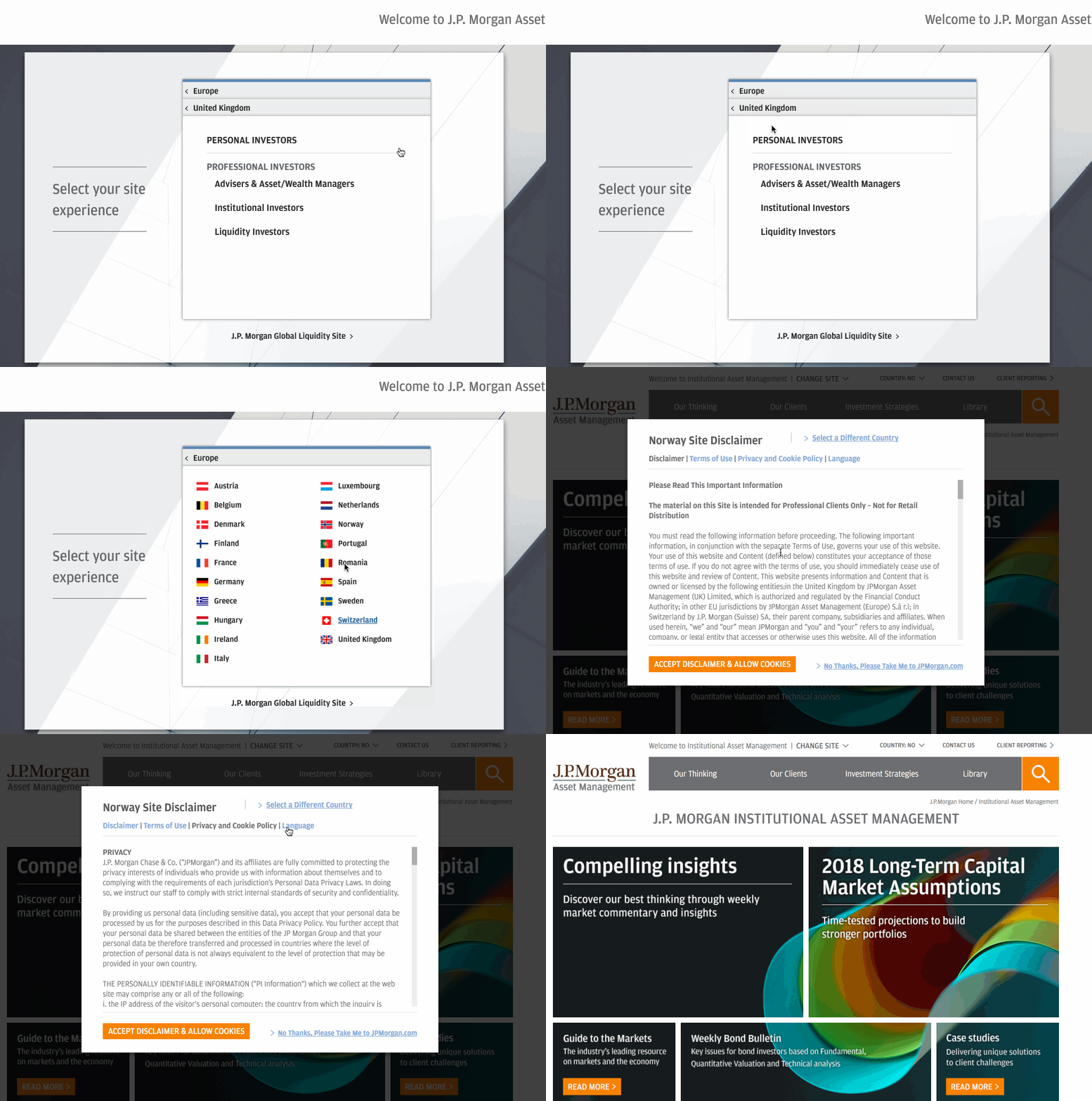
The asset management arm of J.P. Morgan’s website also houses its attestation in the top right of the site’s main toolbar. The user has to exact a few clicks, but all of the information is housed in one place. After selecting the location (again, displayed smartly using flag icons), the user can define their investor type and is then directed to a menu which, like Generali’s example, contains all of its information in a menu that can be immediately browsed through using a toggle toolbar. The user has the option to accept the disclaimer or decline, to then be redirected to the J.P. Morgan global site.
5. Jupiter Asset Management
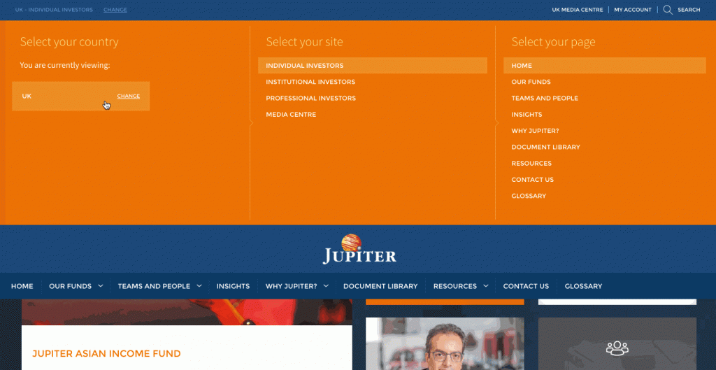
Rather than relying on a pop-up window, Jupiter’s attestation works as a drop-down mega menu. And whilst other examples load the ‘next stage’ information, all the required choices for a user are featured in one view here. All encased in the asset manager’s idiosyncratic orange colour scheme are options for individual, institutional or professional investors to access their relevant sites. The user is then given the required legal information, but also given the option for their selections to be remembered by the site before accepting or rejecting the fairly succinct legal notes.
6. State Street Global Advisors
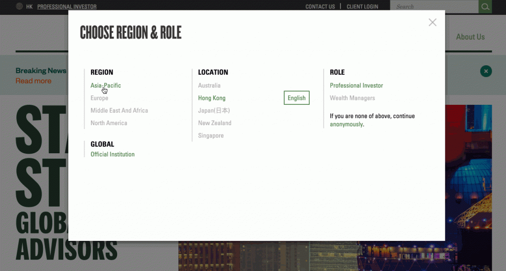
State Street’s example is fairly similar to Jupiter’s given above in that it houses region, location and role choices in one large menu for maximum user experience and limits the number of pages one has to visit. Once all of this information is supplied, the scrollable disclosure appears, also with the option for the user to ‘opt-in’ to the fact that the location profile will be saved as a ‘default’ for future visits to the website. As with all of these attestations, this example is fully responsive: a key aspect of web design that we see as highly important here at Kurtosys.
Attestations are a requirement for many asset management sites in order to tailor their wealth of information for different regions and investor types, but as shown above, user experience is of the utmost importance for these site features. Reduced number of clicks, clear calls to action and even the condensed display of legal information all contribute to the success of an asset management website.
