Every product and every service has a user experience. Think of the last time that a service you use regularly, like your bank’s website, did a redesign of their website. How did it affect your experience?
Experience design is an important part of a great fund manager’s website. It determines how good a user’s interaction is with the website — a process that should be initiated in the early planning phase of your website design and continuously maintained after your website’s launch.
Common, everyday elements of experience design that you encounter on the web are fonts and colours, responsiveness, use of images and icons, and page loading times. There is a new type of UX that makes your site easier to navigate and even adds an elements of fun — micro UX.
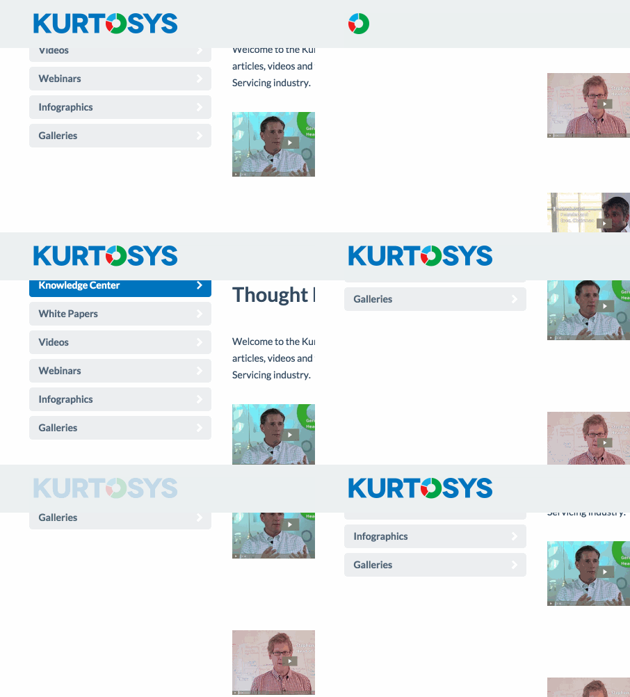 A micro user experience is a single small feature or transition added to a website to make it friendlier, more human. Unlocking your smartphone is a micro experience and so is the startup sound that plays when you boot up Windows.
See the intuitive ways that these ten asset management websites are using small user experience elements to transform a potential client’s visit from run of the mill to something that leaves a lasting impression.
Goldman Sachs
Creating infographics is a visual way to present data and information that is easily digestable. Data visualisation remains a great way to deliver a message in a short and attention-grabbing manner. And if you have a really well designed one, it can lead to hundreds or thousands of content views for your website.
Goldman Sachs took the idea of the infographic to the next level with the use of an interactive and animated infographic talking about Millennials.
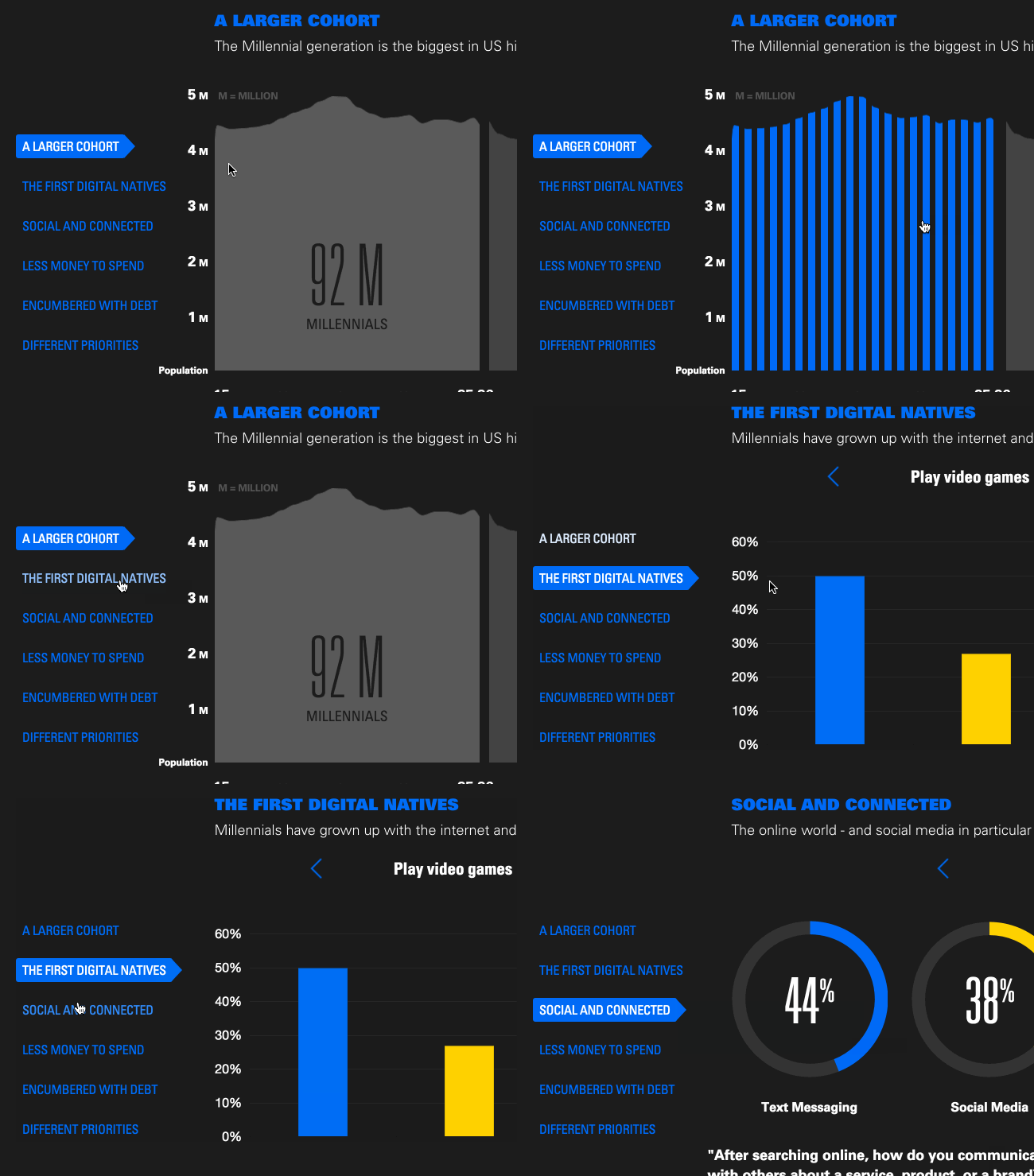 Interactive charts, animated graphics and a good use of fonts and colour bring this infographic to life.
Morgan Stanley
The Morgan Stanley website offers a way to search for a financial advisor in your area right on their website. If you found someone that is available in that location, you can click the “View on Map” link to open a modal window of the city, which also allows you to get directions.
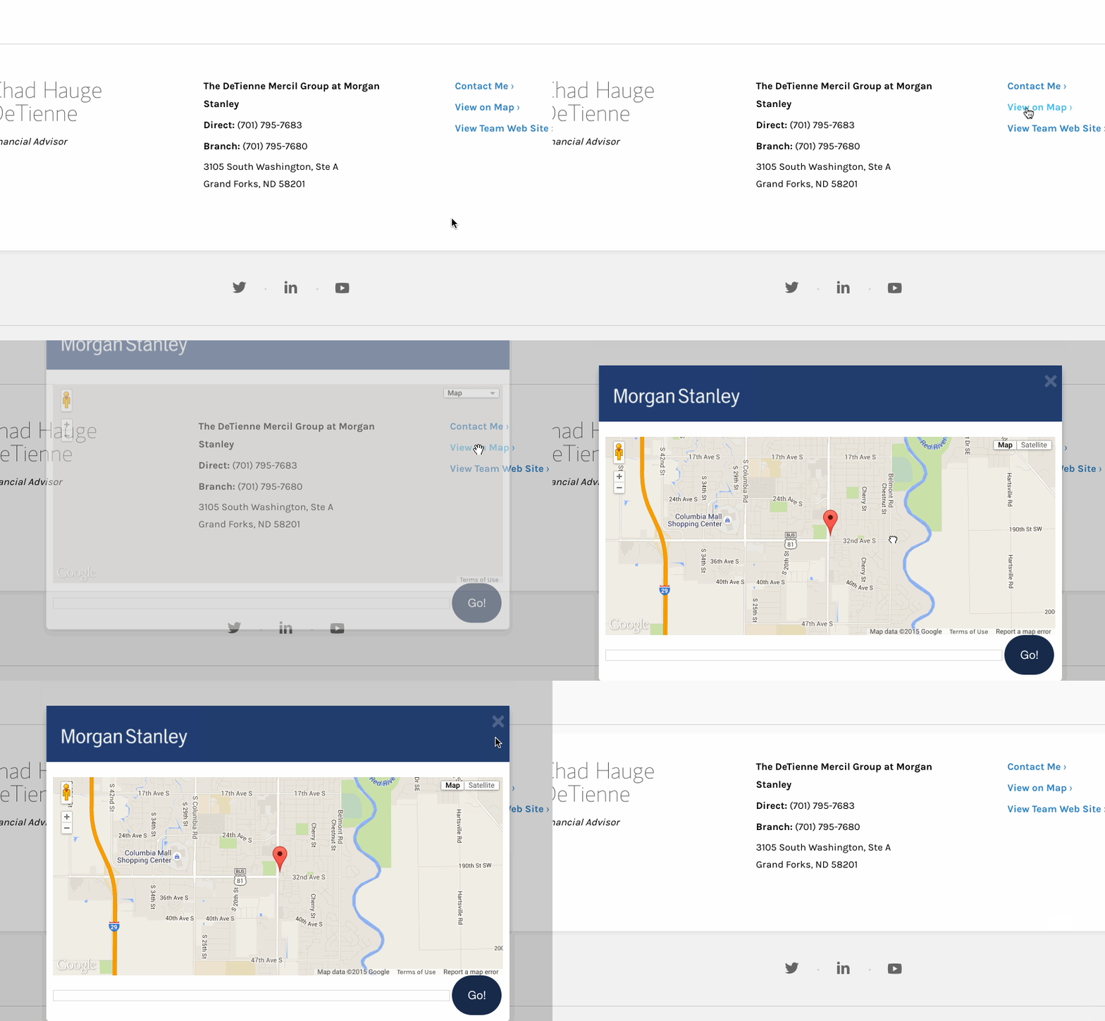 The process to get in touch with a financial advisor from Morgan Stanley is made quick and easy with this functionality.
MFS Investment Management
When you scroll through the history of MFS Investment Management, you can see the historical averages of the Dow Jones Industrial at the bottom that coincide with events in the history of MFS.

Invesco Perpetual
View the key events of the past 20 years when browsing the Invesco Perpetual Fixed Interest microsite.

Aberdeen Asset Management
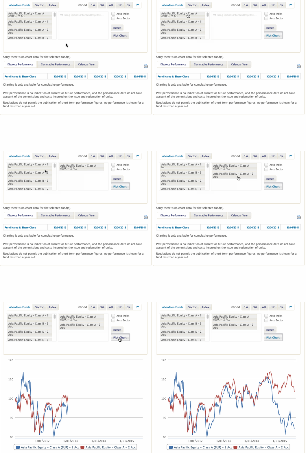
The Aberdeen Asset Management website has an easy to use fund tool that lets you plot funds by simply dragging and dropping the funds you want to compare inside the widget.
 Kames Capital
If you need to find a sales contact for Kames Capital, you hover over the area you’re in to see all the available sales contacts in that area.

Schroders
Schroders make use of a flip effect when you hover your mouse over their latest markets updates.

BlackRock
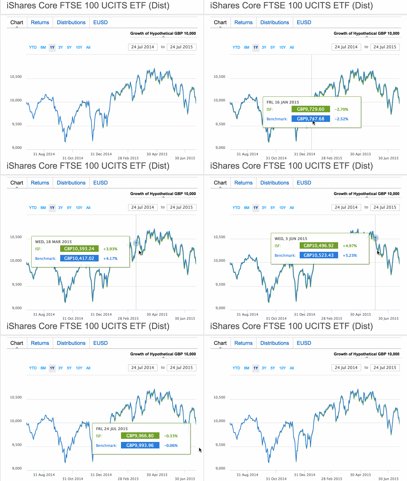
Get instant fund data benchmarks as you hover your mouse over the BlackRock fund graph.
BNY Mellon
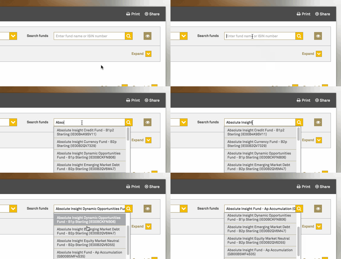
The BNY Mellon website makes use of an autocomplete function in their search box to make it easier for visitors to find the fund they are looking for.
J.P. Morgan
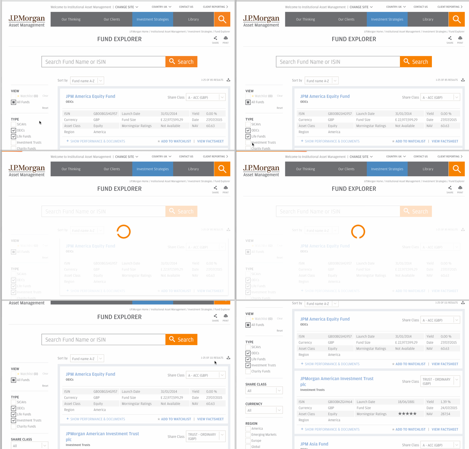
A fusion of great UX, the J.P. Morgan Fund Explorer lets you select a variety of options to explore a customised list of funds.
It’s the little things that can create a big impact. These ten asset managers certainly think so — they understand the interesting and unique experiences micro UX brings to their website. Have you noticed other asset managers that incorporate micro UX design on their web design?
View the GIF gallery of Kurtosys fund tools to see more examples of micro UX design that can be incorporated on any investment management website.
For more inspiration and tips on web design for asset management, please download our white paper.


