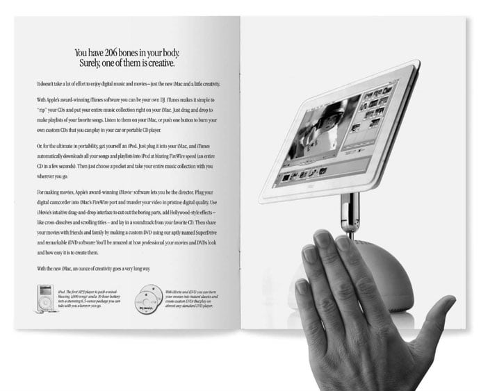
“If you can’t tell who’s talking when the trademark is covered, then the brand’s voice is not distinctive.”
The hand test is a quick and dirty way to test out brand distinctiveness.
So, what would happen if you erased the brand logos from a bunch of fund factsheets?
Would any jump out at you? Would any stand out just a bit? Would there be any striking differences at all?
Does it even matter?
The quick answers are NO and YES.
Put simply, most fund factsheets look identical. Yes, the data is different, but even to the trained eye it looks the same.
So, why does it matter?
Well, because we live in a visual world where each and every one of us, clients included, are being trained to rely more and more on visual and pictorial clues.
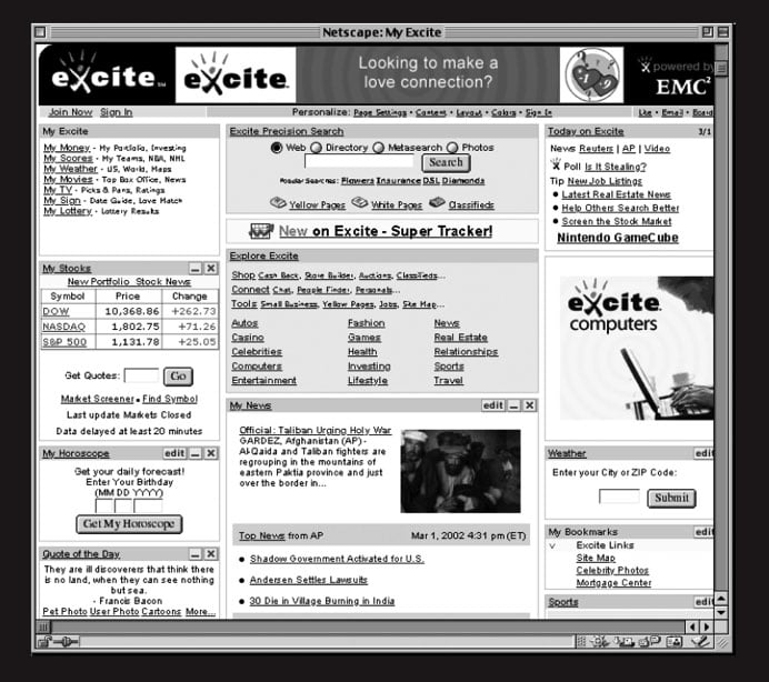
We’ve gone from websites like this:
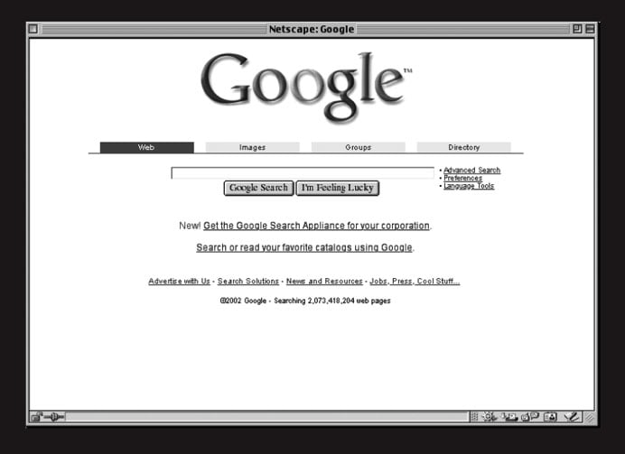
To websites like this:
and our love of simplicity means that color, layout, typography, charts, images – in fact every single element of data visualization and design is more important than ever.
(Check out the source of these images, The Brand Gap slideshare presentation for a much more detailed and engaging look at how branding is changing.)
When you throw in the complex data that fund factsheets convey, the importance of design grows even stronger because images help people tease out meaning and patterns from complexity.
For a great snapshot on why, watch The Value of Data Visualization or just try and quickly count the number of 7’s in this image borrowed from it:
Simply adding some color makes it a whole lot easier.
Kurtosys CEO Mash Patel recently blogged about a fund factsheet branding session he held with a client to identify how their fund factsheets could really embody their brand.
Of course it takes more than painting some numbers blue, but there are ways to convey data beautifully. There are ways to make messages stand out and there are ways to encourage clients to engage with even standard documents like fund factsheets in a way that can deepen their relationship with the brand.
Mash found the visual outcome of the branding workshop dramatic and the chances are that the clients who receive and read those redesigned fund factsheets will too because all of us are hugely influenced by color and design – whether we realize it or not.
Over the next few posts we’ll be taking a closer look at how data visualization is changing the way that financial brands communicate with their customers. We’ll talk about the impact of visual design and how digital tools and desktop publishing are democratizing beautiful, compelling data diagrams. We’ll suggest some tools that asset managers can use to introduce visual storytelling and share some of our favorite financial infographics too.
According to Forrester, 2013 will be the year that information visualization (“infovis”) goes mainstream[i] so join us in examining the impact of data visualization on asset management.


