Review of BMO Responsible Global Equity Strategy
ESG Profile and Impact Report 2020
At Kurtosys, we put customer experience at the heart of tool development, including in environmental, social and governance (ESG) investment reporting. Good data visualization is essential for user experience. But ESG data is a pain point for many asset managers – so our series ‘Leaders in ESG data visualization’ aims to help.
In each article, we focus on one asset manager who excels in this space. We will examine their highlights, principles and approaches to help bring some much-needed clarity to this area. In the first review, we examine the 2020 Profile and Impact Report for the Responsible Global Equity strategy at BMO Global Asset Management.
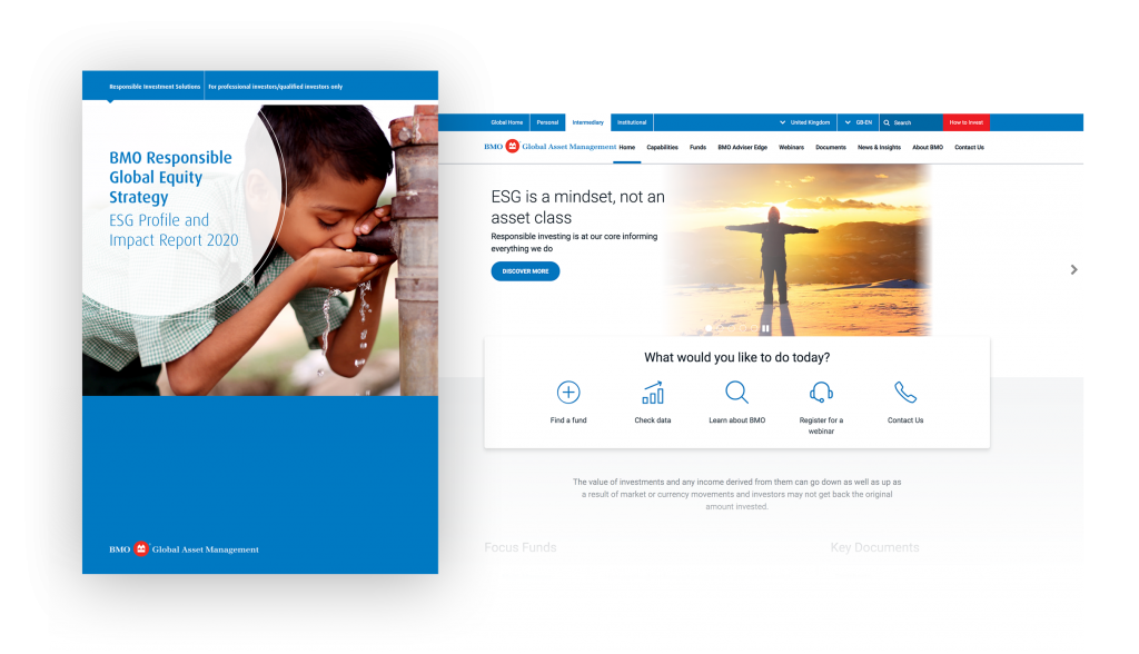
BMO: overall experience
Looking at BMO’s website, the first thing you notice is the general design and layout. In our recent article The 25 best-designed websites in asset management, we found that BMO’s information has clear and easy to access modules with a no-nonsense naming structure. Coupled with well worded and thoughtfully laid out content, the overall experience was incredibly focused and clearly data driven.
We’re delighted to see much of the same in this impact report. We love the consistency of approach and attention to detail that provides a single user experience across multiple channels.
Philosophy
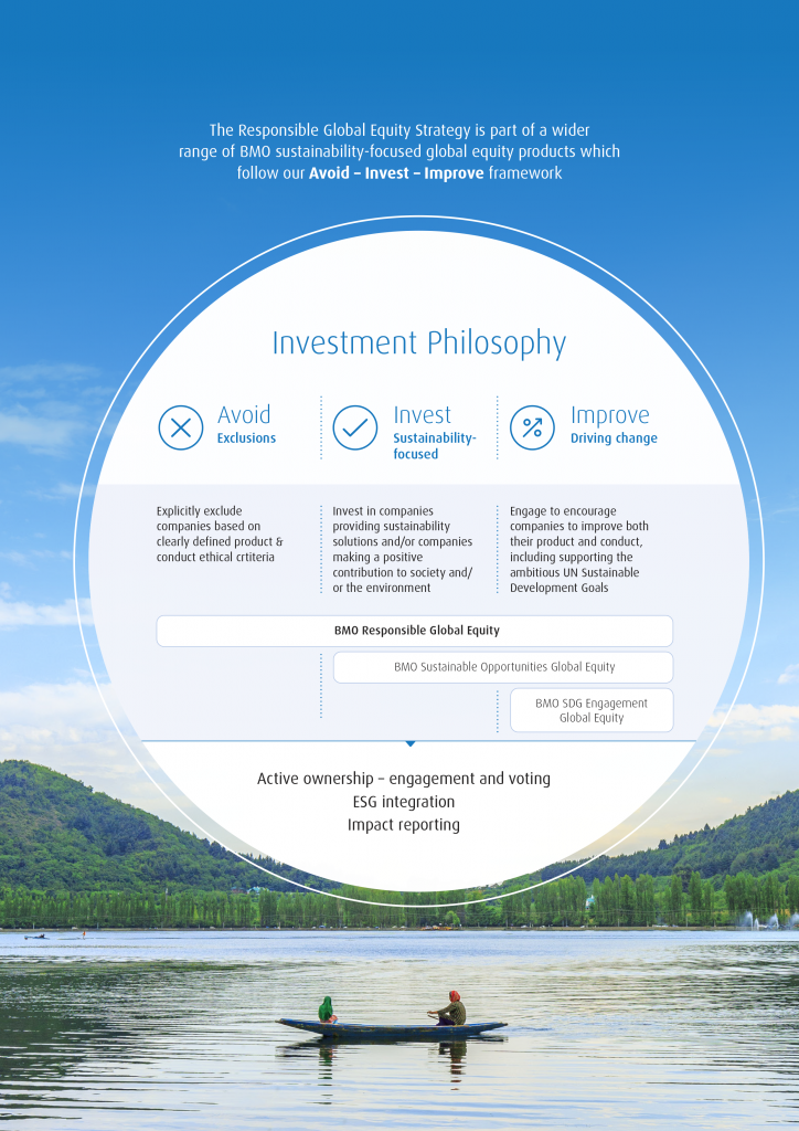
The report starts with an infographic that highlights BMO’s investment philosophy. It clearly outlines the three core elements to their ESG approach. Below that is a band showing how their funds and activities sit in relation to these philosophical elements.
Another section then highlights the governance and process behind the principles. The imagery behind the graphic enhances the impact rather than distracting attention from the core message.
SDG Alignment
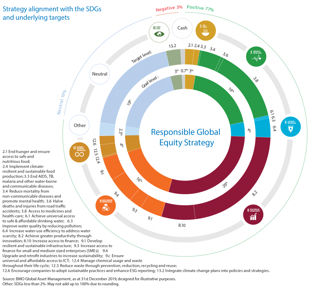
Alignment to the UN’s sustainable development goals (SDGs) is critical to the way users understand BMO’s content. [Link to UN SDG]
Smart application of this color-coded, multi-layered sunburst graph helps show targets against SDGs and the detailed breakdown of alignments for each underneath.
BMO uses the UN iconography – and complementary bespoke additions – cleverly throughout the report to identify how contextual content relates to the SDGs. Color schemes for the icons are also consistent, adding a nice visual separation between the goals.
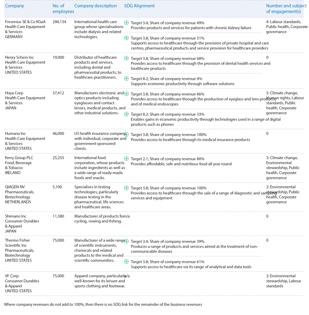
As you get down into the detail of SDG alignment, there is a neatly organized matrix displaying company information and alignment with goals.
When tackling this much detail, the design should not be over complicated. The clearly-structured use of table formats is consistent throughout. There is bold type for each target and simple colored iconography to show which goals have or have not been met.

Pullout quotes
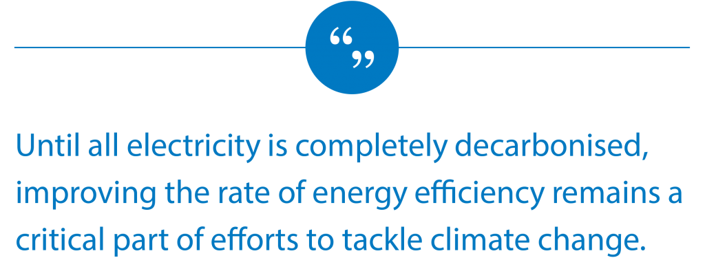
BMO pulls out takeaway highlights or summary information from in-depth content throughout the report. It highlights this with a graphic quote symbol.
This is a great way to give users a focused takeaway for each page and section with lots of information on.

Impact Metrics
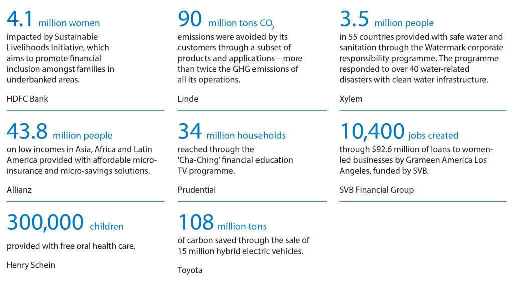
Impact metrics are built to track outcomes that products or services have on the environment or the lives of stakeholders, such as workers and customers.
This information needs a different format. But again, the layout is incredibly clear and simple. It uses a combination of size, brand colors, and bold fonts to differentiate and allow information to almost jump out at the reader.
This approach gives a ‘1+1=3’ effect in which the sum of evidence seems stronger when the parts are visually close together.
Comparative Bar Charts
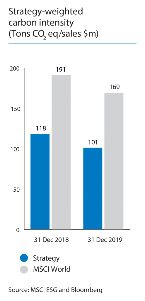
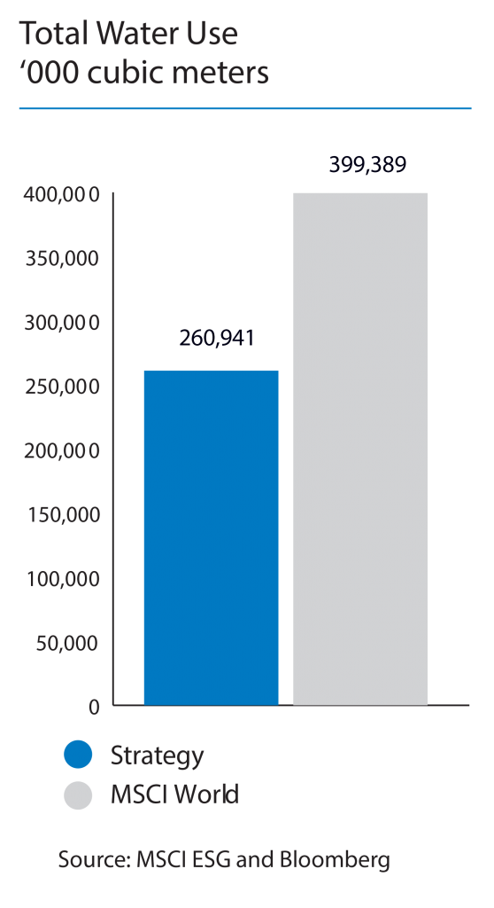
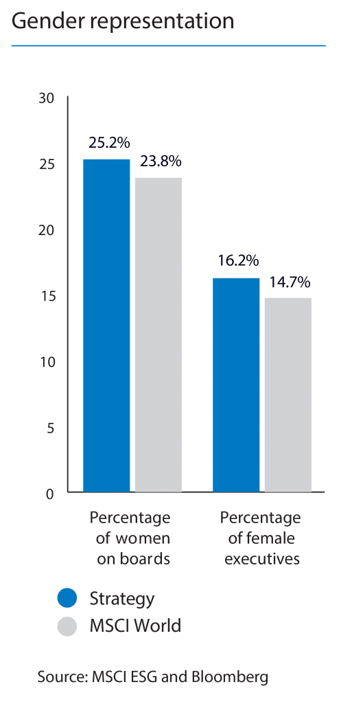
The report moves on to look at how BMO’s strategy compares with the MSCI World benchmark on various ESG metrics. For this, it uses traditional bar charts.
We love the simplicity and the fact that they’re not trying to over complicate the data visualization here.
BMO uses bar charts to compare performance from historical and ‘wider industry’ perspectives. These come with clear contextual information for each comparison.
The limited color scheme – again, in line with company branding – makes visual comparisons easy.
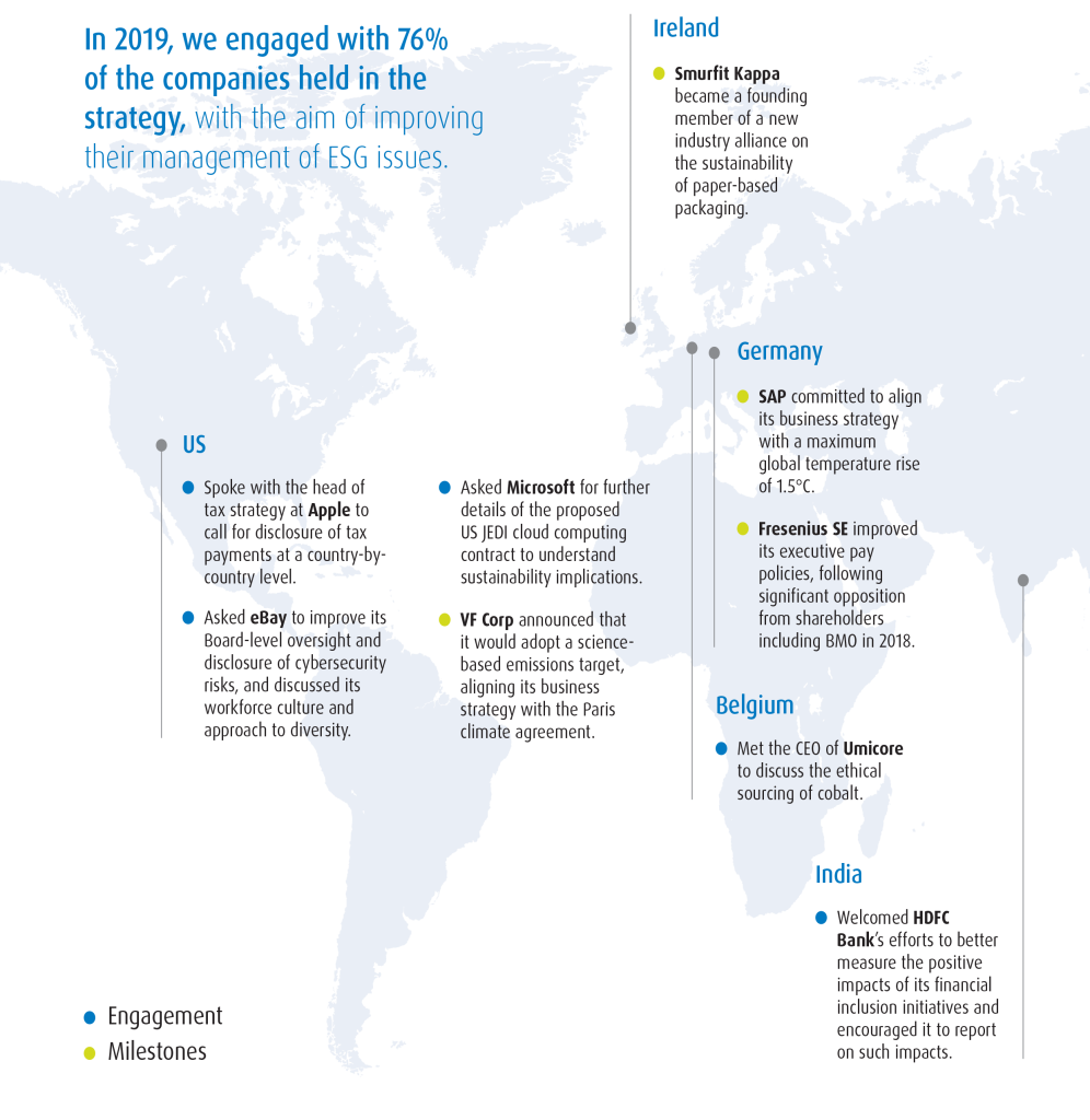
Global Engagement
Often, an annotated global map can become cluttered as organizations try to show as much information, across as many territories, as possible. This can confuse users.
BMO’s simple, two-tone key and clear bold and colored typeface – which is consistent with previous charts – illustrates the message well.
Donut Charts
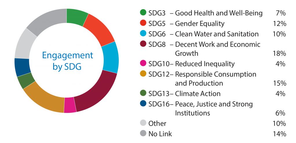
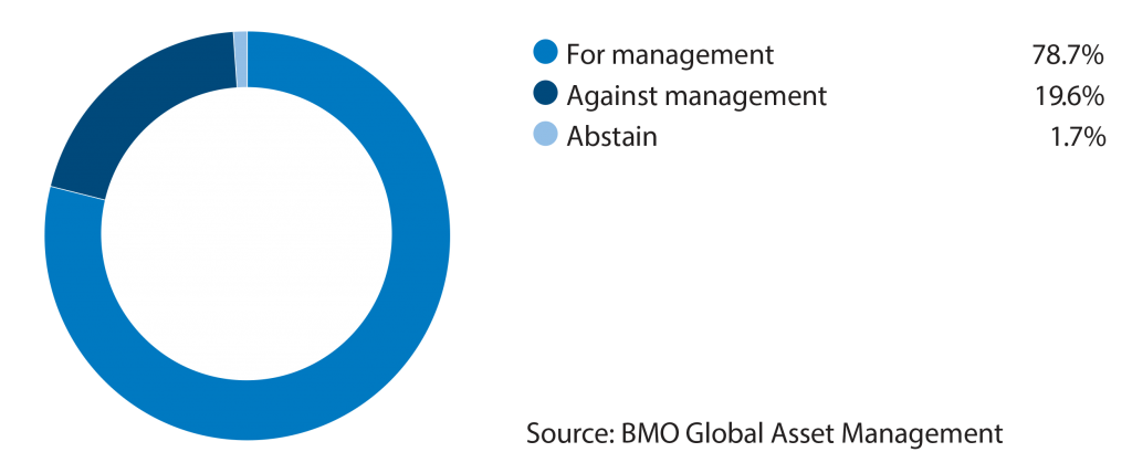
Asset managers often use donut charts in a variety of contexts. They can use them to highlight large, segmented data or simply delineate information more clearly.
BMO’s charts use colorways to clearly connect back to the data they represent. The colors match the UN SDG iconography for engagement; and BMO corporate brand colors for internal voting results.
This approach brings relevance and clarity of purpose, while helping to differentiate the charts.
Timeline
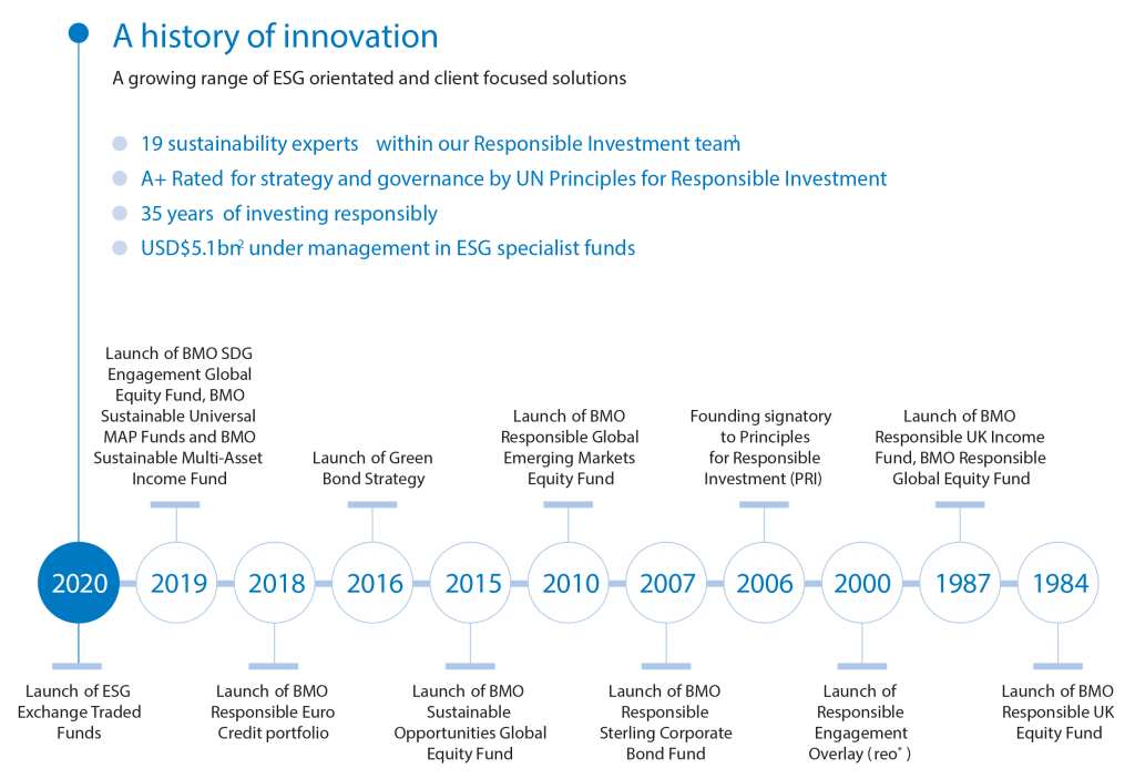
As with global maps, timelines are common in asset management reports. But often they can be over complicated, and difficult to understand and draw key information from.
Not so here. BMO’s timeline demonstrates its history of innovation in ESG solutions, using the same design approach as in the engagement map, impact metrics and SDG tables.
Using the timeline to emphasize key moments in the company’s ESG history is an effective tactic.
Highlights are pulled out and listed above the timeline to reinforce the message without crowding the chart.
Visual Impacts
BMO also uses visually impactful pages throughout the report to break up the data and focus attention on a key message or topic summary.
Background images are sophisticated but not overpowering. They always relate clearly to the subject matter – for example, around ecology and sustainability.

Summary: changing the game in ESG data
In our recent review of the 25 best-designed asset manager websites, we saw some fantastic examples of asset managers embracing creativity and keeping up with modern design practices.
It is encouraging to see how organizations like BMO GAM are also carrying these principles into data visualization for ESG reporting. We believe these approaches are changing the game in the industry, to the great benefit of customer experiences.
At Kurtosys, we are proud of our fast, scalable and easy to use technology. We also love solving data visualization problems with creativity. Are you struggling to keep up with changing trends in data visualization for ESG reporting? Do you need to automate difficult and costly processes, deliver critical data at pace, or update your user interfaces and website design? If so, get in touch today.
Talk to our team and arrange a demonstration of how our tools can add value to your digital transformation.


