Search has been fundamental to the web since its inception, yet most asset management sites lag in terms of their search experience. Given its importance to most site journeys, as well as the potential for delighting investors and advisers alike, we wanted to highlight some key factors in creating a great search experience and some examples to boot.
Offer typeahead with real-time results
Most site searches will force the user to type a search term, hit enter, then wait for a separate page of results to appear. This type of experience can be frustrating as it takes time to view results and, if the required result is not located, forces the user into multiple rounds of trial and error (or even worse they simply give up). Creating interactive typeahead results, also known as autocomplete or autosuggest, is more challenging to do technically but results in a much better experience for the visitor. Users should be able to type a few letters of their search term and immediately start to see results appear in a dropdown. This allows them to discover multiple matching results and narrow down their selection as they type.
Funds, documents, insights and pages
Our analytics show that most visitors to asset management websites are coming in search of product related content and in many cases documents. Make sure that your results prioritize fund related results first pointing towards product pages, as these are a key anchor for most ‘goal states,’ or in other words the thing that the visitor is trying to do when they arrive. Next try to surface up key documents. For example, if I know the ticker or name of a fund, I might type it in the search box, but if my goal is to simply download the factsheet then why make them navigate to a separate page to do this?
While these two cases account for the lion’s share of desired outcomes, make sure you give pride of place to your insights and other content such as capabilities. Search is a great merchandising opportunity to surface related content and keep visitors on your site and learning more about your range.
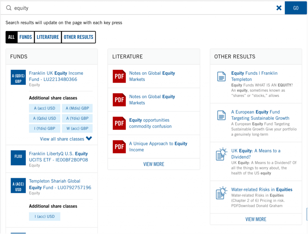
Franklin Templeton do an excellent job of following these rules in their site search, pictured below.

Source: www.franklintempleton.com
Speed matters
The psychology of speed on the web is a widely discussed topic and it goes without saying that the responsiveness of your search results is critical. The goal of your search is to delight your clients and partners by making it easy to get what they need from you – often on repeat visits to your site. If the search doesn’t respond quickly enough they may not use it again. Aim for each result-set to come back ideally in less than a second.
Up and to the right
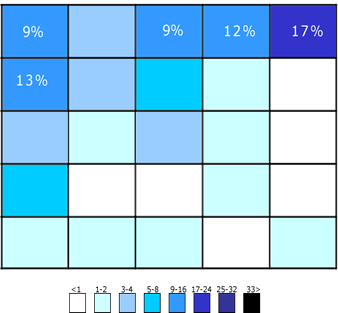
Web historians among you may remember the “Wikipedia” search debacle of the early internet. The abbreviated version is that Wikipedia moved their search box to the lower left quadrant of their site, much to the chagrin of their user base. They subsequently reversed the decision, restoring it to the top right of the site, where it sits forever more. This article describes their reversal in more detail and, despite being over ten years old, still rings true today.

Figure 1: Expected Location of Site Search Engine. Image: Wikimedia.org
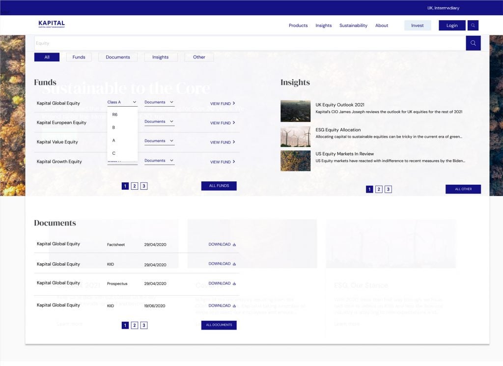
Placing your search box to the top right of your site has become one of the better understood UX axioms of the web’s history. Yet it can be a struggle for asset managers to incorporate, competing as it does for pride of place with investor and country selectors, login buttons, and more. Again, Franklin Templeton do one of the best jobs we’ve seen of this by locating the search button in the top right but providing a dropdown for the input box.

Source: www.franklintempleton.com
Don’t Forget Your LAMA
As with so many complex fund buying user experiences, merely getting to ‘good’ can seem like such a lengthy undertaking that what lies beneath can often be forgotten. The ‘LAMA’ elements as we call them here – localization, accessibility, mobile, analytics – can have a real sting in the tail, so it pays to think about them upfront:
- Localization: If you have localized country sites, make sure your search is localized too. Your fund data, document names, and other data driven content should be in local language, as should all labels. Content search should also target local language, and ideally account for accents in words.
- Accessibility: You will be marked down in your WCAG tests if your search isn’t accessible by a screen reader, so make sure the search box and results are appropriately equipped for this purpose.
- Mobile: What works on desktop for search needs to be completely rethought for mobile – you simply won’t have the real estate. Don’t boil the ocean with a complex UX, keep things simple but offer the same result-set in a simplified form that is easy to navigate on mobile.
- Analytics: Ensure your search is set up to track search terms and clicks as you would do for any other key journey. Integrating all the actions with your analytics provider’s data layer will tell you what’s working and what isn’t.
Need Help?
If you’d like to improve the search experience on your site but the thought of doing so seems just out of reach, we can help. Alongside our existing range of investment data experiences, we’ve built a new global search module that does all the above and more.

In brief, the Kurtosys Global Search module can:
- Integrate fund data, documents, and other content types in one interactive search module (and works even better with a DXM site).
- Be embedded easily into any website
- Surface results in lightning quick speed
- Be configured and styled exactly according to your brand
- Support all the “LAMA” categories above
- Delight investors and advisers alike
If you’d like to learn more, get in touch today. Talk to our team and arrange a demonstration of how our tools and services can add value to your digital transformation.


