Leaders in ESG Data Visualization

At Kurtosys,  we put customer experience at the heart of tool development,  including in environmental,  social and governance (ESG) investment reporting.  Good data visualization is essential for user experience.  But ESG data is a pain point for many asset managers.

Below are some fantastic examples of asset managers embracing creativity,  modern design principles and best practice across their ESG reporting.  They deserve credit and we hope this series gives them some.

In each article,  we examine the approach of one asset manager who excels in ESG reporting.
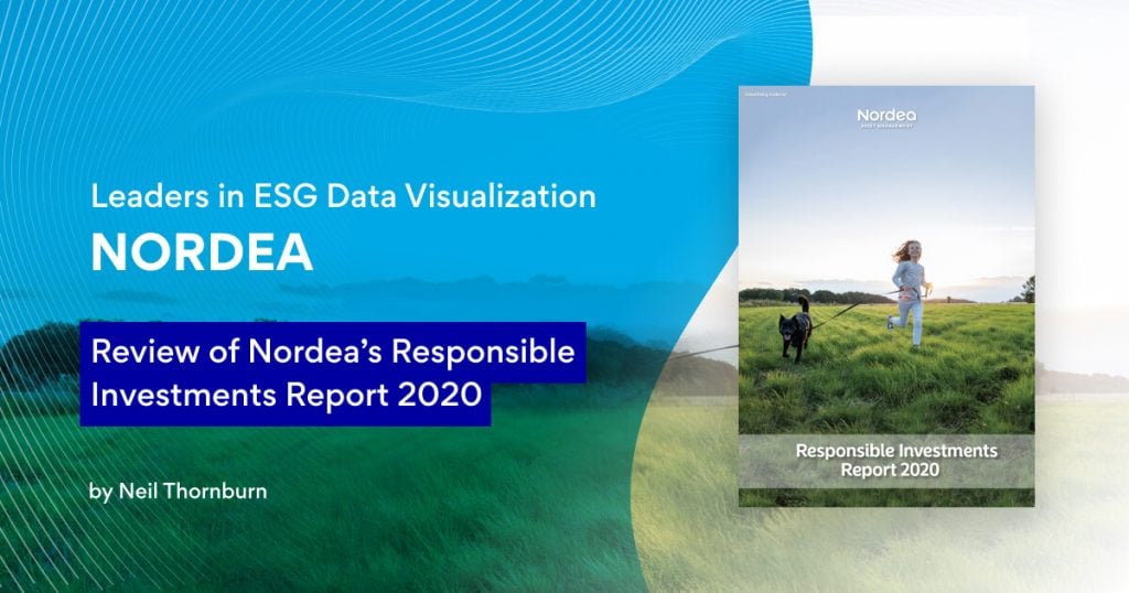
We examine Nordea and specifically their Nordea Responsible Investments Report 2020.  Nordea sets a great benchmark across the industry.  When ESG is this important to your company,  you put the effort in.

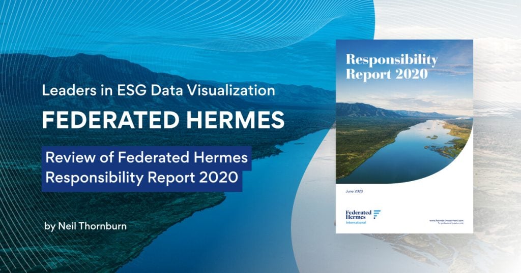
We profile Federated Hermes and in particular their 2020 responsibility report. One of the more established names in sustainable investing, Federated Hermes have a long tradition of engagement and SRI, so we were interested to see what other managers could learn from their client communications.

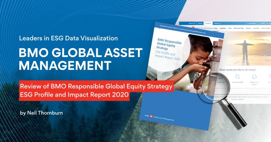
The next asset manager we look at it BMO GAM and we examine their 2020 Profile and Impact Report for the Responsible Global Equity strategy at BMO Global Asset Management.  It is encouraging to see how BMO GAM are embracing creativity and keeping up with modern design practices in data visualization for ESG reporting.  We believe these approaches are changing the game in the industry,  to the great benefit of customer experiences.

WHITE PAPER

Our study entitled “The ESG Digital Revolution” seeks to examine the current intersection between ESG data and technology and its future direction. We spoke to a range of senior market participants from well-known firms and our findings are based on a series of qualitative interviews with a wide range of senior leaders. We have sought to identify the pain points that exist for the industry and the solutions and opportunities they propose.